The top AWW sites are pushing boundaries within the immersive web experience. An extensive range of industries from a boutique ice cream shop, to an immersive 3D city model, these sites use a multitude of engaging effects to keep the user scrolling. These sites are pushing boundaries through brutalist typefaces, animation, and the use of 3D space.
Storytelling with Brutalist Typography
Paying homage to the Brutalist design trend, these sites use large sans serif typefaces to convey the story of their brand.
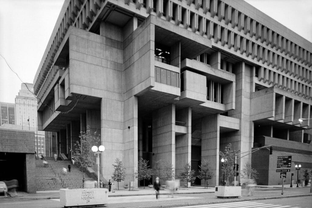
The Brutalist design trend comes from Constructivist architecture of the 1920s, and the Art Brut movement of the 1940s. You might be wondering what this have to do with websites being made currently? Well the entire purpose of Brutalist architecture and art is to focus on direct honesty. The goal is to get to the purpose of the object or design without extra decoration. This is what the typefaces on these top ten AWW sites achieve; direct honesty with added flair.
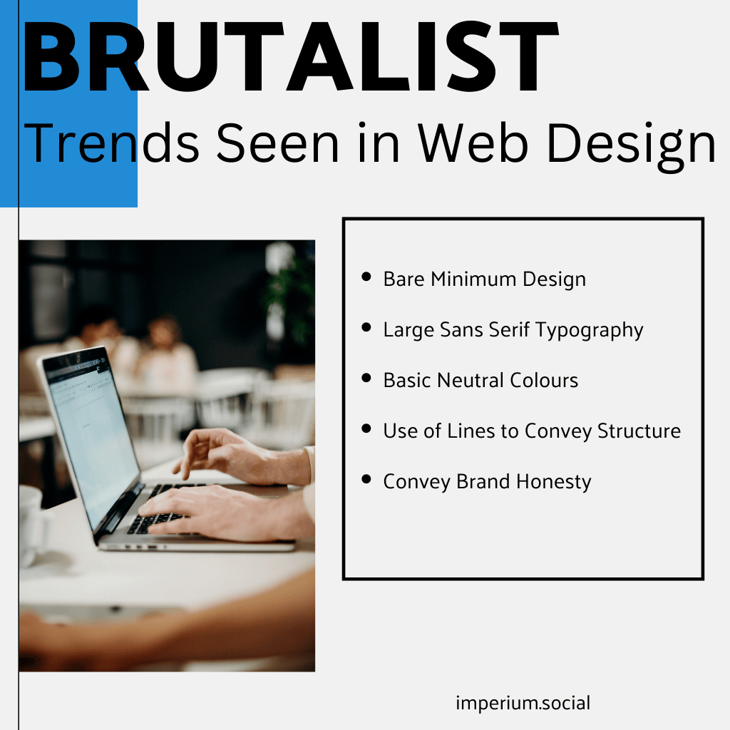
Brutalist Trends Seen in Web Design
- Bare Minimum design
- Large sans serif typography
- Basic colours (black, white, neutral greys)
- Use of lines to convey structure
- Conveying brand honesty
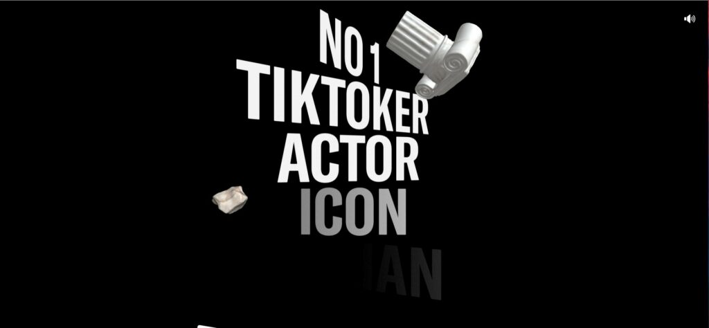
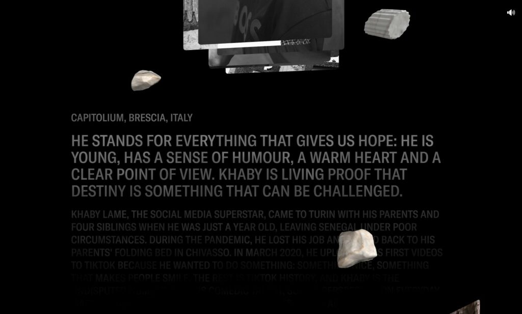
Taking a closer look at the large typography aspect of Brutalism. This design trend can be seen on the Khaby Lame site where as the user scrolls down the page, the large fonts rotate in 3D space. The story of this internet icon is told through the information being placed in the center of the screen in a high impact font (GT America). This large sans serif typeface is used with high impact to create an immersion as the user scrolls.
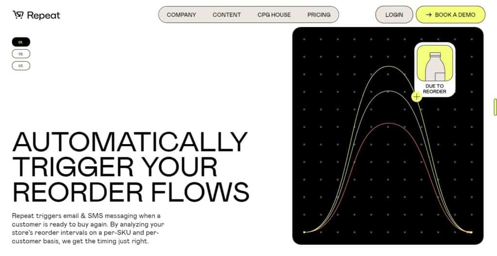
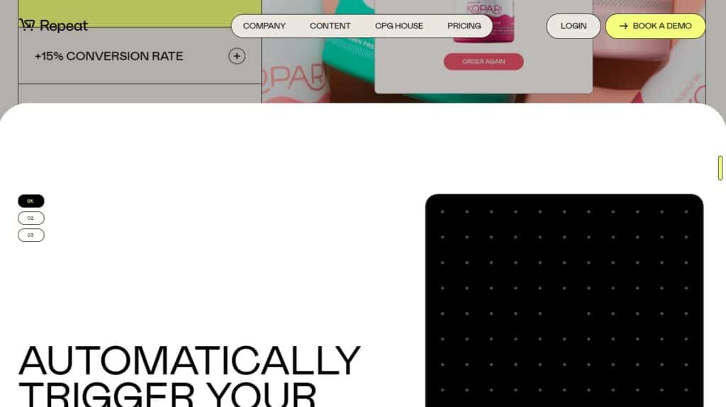
The use of this Brutalist design trend is more subtle on the Repeat website. By organizing the text on the left side rather than front and center like the Khaby Lame site, it allows visual space to breath. It achieves two distinct things by offsetting the type: it allows space for animations, and makes the text information more digestible by leaving the use of large fonts for headings only. Allowing fonts to be read within one viewport makes this webpage feel more inviting. The tension between the crude typeface on the left and the polished look of the animations on the right give this site extra interest.
Using Animation in Web Design
Let’s take a look at where animation is placed on these websites and why the use of motion adds such an impact.
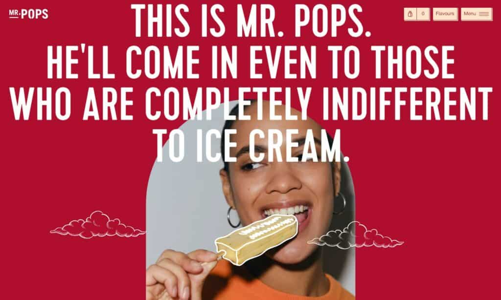
On brand preloaders to websites are a popular place to add animation. A preloader is what a user sees before they can directly interact with the webpage. Right away it adds interest, a large company feel, and personality. These transitions are typically the company name with a loading progress bar or done creatively like on the Mr. Pops site.
Mr. Pops uses the preloader which incorporates the company logo and loading circle. When the preloader transitions to the hero section, the hero section seamlessly pushes the preloader out of the way.
Animation is used on these website’s homepages with great effect. To add aesthetic interest like on the Mr. Pops site of having doodled lines vibrating, or to convey brand purpose and information on the Repeat site. This combination of on brand animation to add visual interest or information in a polished styled way is what makes these sites front runners.
The Use of 3D in Web Design
Making 3D on a two dimensional surface has been a task of artists for centuries. These designers are using this illusion of space in their web designs today. Let’s look at the bold and subtle use of 3D to make these websites frontrunners of the 3D design trend.
First let’s look at the Khaby Lame site. We know the impact of the rotating large font seen on this site. But there are other elements floating on this webpage that help create an illusion of space. 3D rendered columns, and what look like rocks or asteroids are floating behind and in front of text which add to the 3D illusion.
The subtle use of 3D can be seen on the Repeat site. While not distracting from key brand information being conveyed this site uses “cards” overlapping as the user scrolls. Adding mouse follow effects also add a sense of playfulness and personality to the site. Fading the “cards” in brightness and saturation adds to the 3D feel.
Summing It All Up
These sites are designed by the forerunners of website trends and showcase a variety of design techniques to keep the user on the page. The three mentioned here were the use of large typefaces as a means to tell a story, animation to convey interest or information, and the use of 3D space to add depth. These top AWW sites show the best use of all three of these techniques, and make them frontrunners in web design today.